
Fonograph – objective audio comparison
A new diagnostic software tool for the music industry
Have you ever thought a pressing sounded muddy? Loss of high end? Loss of low end? And wondered whether the problem was with the master, the cut, the galvanics or the pressing?
Fonograph is a new software tool, developed by Stamper Discs in 2020, that can help diagnose these issues. No more subjective arguments about what the cutting engineer, the pressing plant, or the artist is hearing – just an objective comparison of the differences between two recordings.
What is Fonograph?
It’s a cloud-based app which plots the frequency/amplitude distribution of two recordings of a piece of music, and then shows a visual comparison.
Whilst many existing pieces of software can compare two songs in real time (and this is very useful for digital masters) they don’t work so well if one of the things you are trying to compare is a vinyl record. With recordings taken from records, there is a certain amount of variability between two recordings, and if two recordings aren’t perfectly lined up to the millisecond and are out of sync then the results can’t be relied upon.
What Fonograph does is analyse the frequency range of entire songs at a time, meaning that one or two seconds of silence at the end of the recording, or even the odd click, won’t skew the results. It uses the Fast Fourier Transform (FFT) algorithm to compute the amplitude of each frequency (at 1Hz intervals, from 1 Hertz to 20k Hertz). This gives the ability to focus in on particular frequency ranges. You’re only interested in 6khz to 8khz? No problem! Just look at that range. You’ll be able to see exactly how things line up.
What can Fonograph help with?
We initially developed Fonograph as a means of testing the effect of process variables in galvanics on the sound of the finished record. We needed a way of seeing precisely the differences between a recording from a lacquer, and the recording from a test pressing, as a result of changes such as:
- the fineness of the grit used for backsanding;
- or the pressure applied to the sanding pads;
- or if we altered the pre-plate dwell time or the current ramp
- Is there any difference if a lacquer is plated immediately after cutting compared to if it is kept in a fridge for two weeks?
… and so on.
But we soon realised the scope of the software was much broader.
For example, Fonograph enables:
- pressing plants to test different vinyl compounds, or the set-up of one press compared to another.
- engineers to compare the difference between one lathe and another, or how the audio on the lacquer compares to a digital master.
- anyone interested in vinyl sound to see the effect of different styluses, cartridges or amps.
- buyers and artists and pressing plants to compare the test pressing to the lacquer, or a test pressing to a production run pressing. If there has been any audio degradation, Fonograph can tell you at what stage it happened.
If you’ve ever wanted to make any of these comparisons, then this is the tool for you. Get in touch with Martin Frings to learn more.
Fonograph in action: Lacquer versus Direct Metal Mastering (DMM) comparison
Here’s an example of Fonograph in action. This is a comparison of the same digital master track, cut onto a lacquer, and also cut onto a DMM. The DMM engineer will tell you that his cuts are the best reproduction of the master; the engineer with the lacquer cutting lathe will swear by the sound from a lacquer…
The charts below show an objective comparison.
But first, listen to a 60 second excerpt from each cut
Audio 1
Audio 2
Can you hear any differences? If you think you can, which is the DMM and which is the lacquer? (the answer is at the end).
Let’s look at what Fonograph tells us.
The software has a default analysis range of 0 – 20 kHz. The human ear tops out at around 20 kHz, and this is also the technical limit of the frequency range of a record. But most cutting engineers restrict the upper limit to 15 or 16 kHz. This particular recording (and most pop/rock/indie recordings to be honest) doesn’t really have a lot going on above about 5 kHz. A classical recording, or for example, a track with instruments like bells and chimes, will have a lot more information than this all the way up the spectrum. But with this particular track, lets narrow down the range to 0 Hz to 7 kHz.
The blue ‘baseline’ plot represents the lacquer, and is overlaid with the orange ‘comparison’ plot, which is the DMM.
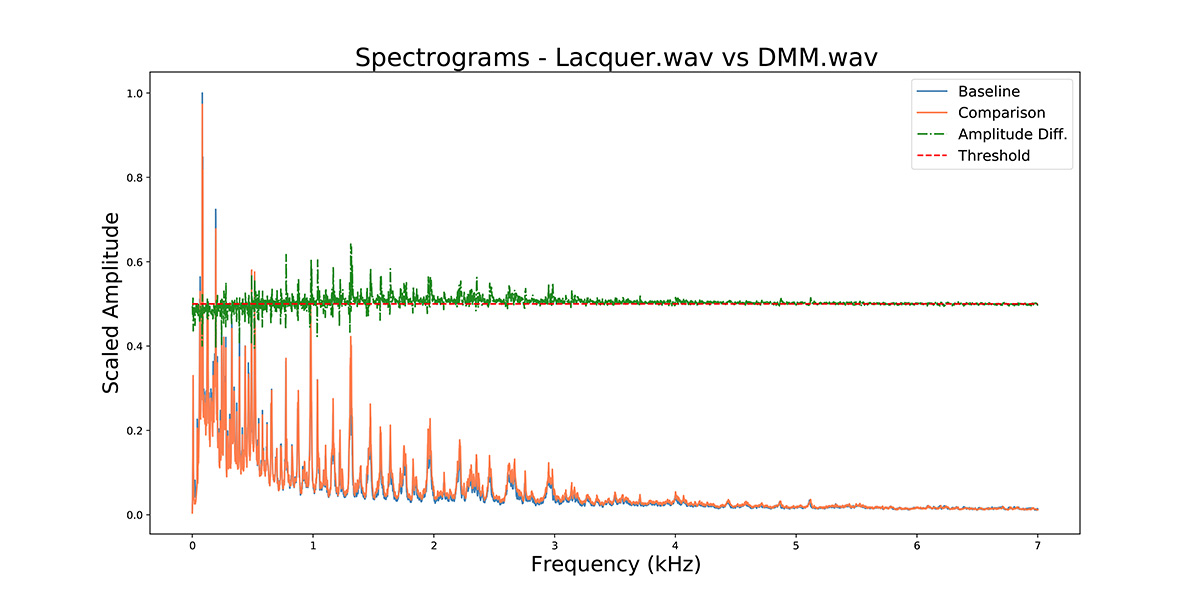
The two recordings look very similar, but you can see some small blue peaks at the low end of the frequency range, while at the higher end, the amplitude of the orange/DMM plot is more pronounced.
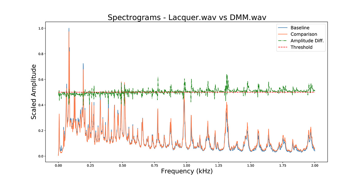
If we narrow the range down even further to between 0 – 2 kHz, you begin to see more clearly that the lacquer is reproducing the low-end bass at higher amplitude. But at around the 1 kHz mark, the recordings begin to diverge, and the DMM (orange, ‘comparison’) is showing higher amplitude.
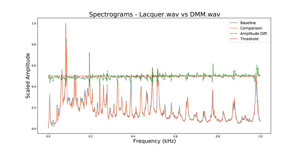
If we focus down further, and look just at the range 0 – 1 kHz, we can see more clearly that the blue peaks show that the lacquer is reproducing the low-end frequencies louder, equating a more dynamic and fuller bass sound.
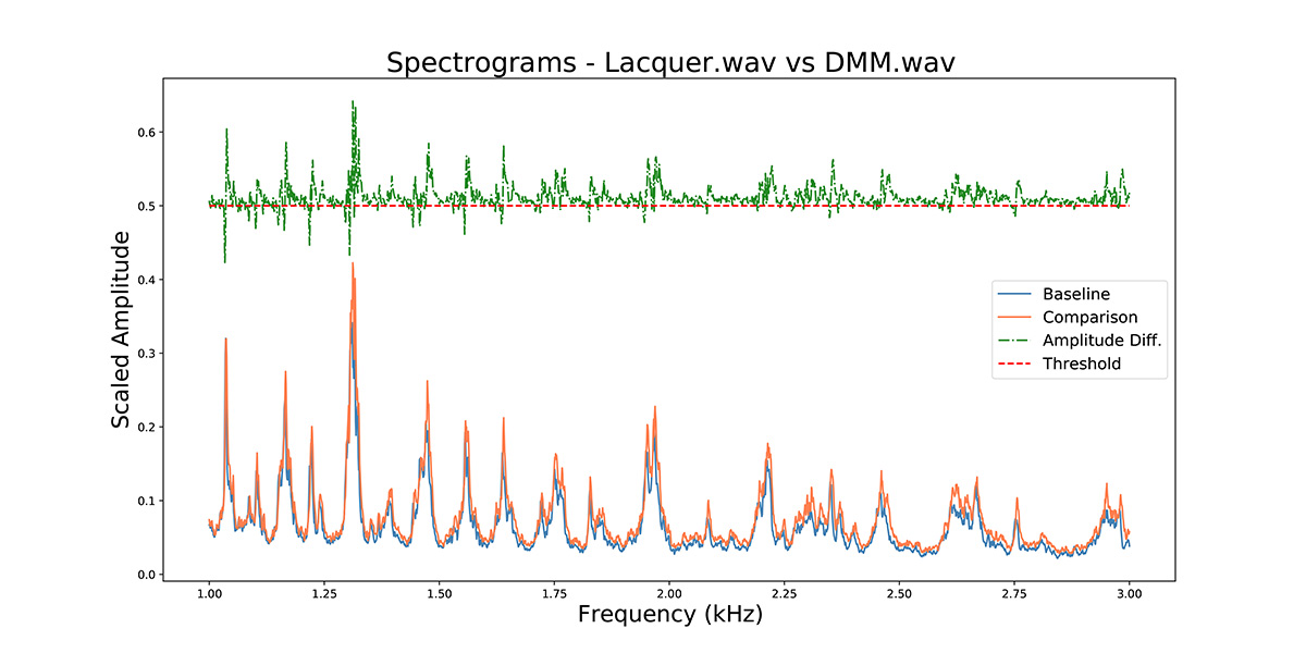
But if we look instead at the range 1 – 3 kHz, the orange peaks show that the DMM is reproducing the frequencies above 1 kHz louder, representing a brighter, more ‘trebly’ sound.
So which was which, and did you get it right?
Audio 1 was the DMM (‘Comparison‘ in the charts above)
Audio 2 was the lacquer (‘Baseline‘ in the charts above)
The differences are quite subtle, and in a blind listening test the majority of ears wouldn’t pick up on these.
On a booming drum ‘n bass track, the divergence between the two comparisons on the low end would be a lot more noticeable. But for most pop/rock music, Fonograph shows that the choice between the two cutting substrates isn’t as straightforward as some people would believe. The DMM has more dynamism (higher amplitudes) at higher frequencies, which can be heard in some of the finer instrumentation on this recording. The lacquer has more dynamism in the frequency range below 1khz, which results in what is often described as a ‘fuller’ or ‘warmer’ sound. The lacquer also has very slightly more surface noise.
The answer, of course is to be guided by the music. A light classical track, with lots of delicate instrumentation and quiet points, will sound ‘better’ on DMM, whereas a pop or rock band risks sounding ‘tinny’. But as Fonograph shows, the differences are more nuanced than many people would have you believe.
Technical background
Fonograph reads an audio file and then applies a Fast Fourier Transform (FFT) to the frequency and amplitude information to arrive at a distribution of the amplitude at each 1 Hz frequency bin. This is then plotted for each individual file.
Sampling rate: A recording is sampled at 44.1kHz. This should be the sampling rate of files submitted for analysis. Selecting a sampling rate that differs from the sampling rate encoded in the audio file is significantly slower as the software needs to resample the audio file and interpolate or average the frequencies.
Stereo to mono conversion: the comparisons occur after a stereo audio signal has been forced down to mono by averaging samples across channels.
Amplitude scale: The maximum amplitude from the ‘Baseline’ file is scaled to 1, and the ‘Comparison’ file is displayed relative to it.
Amplitude Difference: shown in green. This represents the difference in amplitude at each FFT frequency bin.
Threshold: this shows where the baseline or comparison file amplitude is greater (relative hot or cold spots).
Audio Analyser module: The system builds upon the Audio Analyzer module as described in https://towardsdatascience.com/a-data-scientists-approach-to-visual-audio-comparison-fa15a5d3dcef
The module was written by Quinn Dizon, , https://quinndizon.com/
The GitHub repository for the Audio Analyzer module is: https://github.com/QED0711/audio_analyzer
The code in the module was modified slightly to return images.